Boosting the user experience to increase sales for Stumptown
A conversion-focused redesign of the Stumptown shopping experience: clearer orientation, stronger product details and a smoother checkout, designed and prototyped for desktop and mobile.
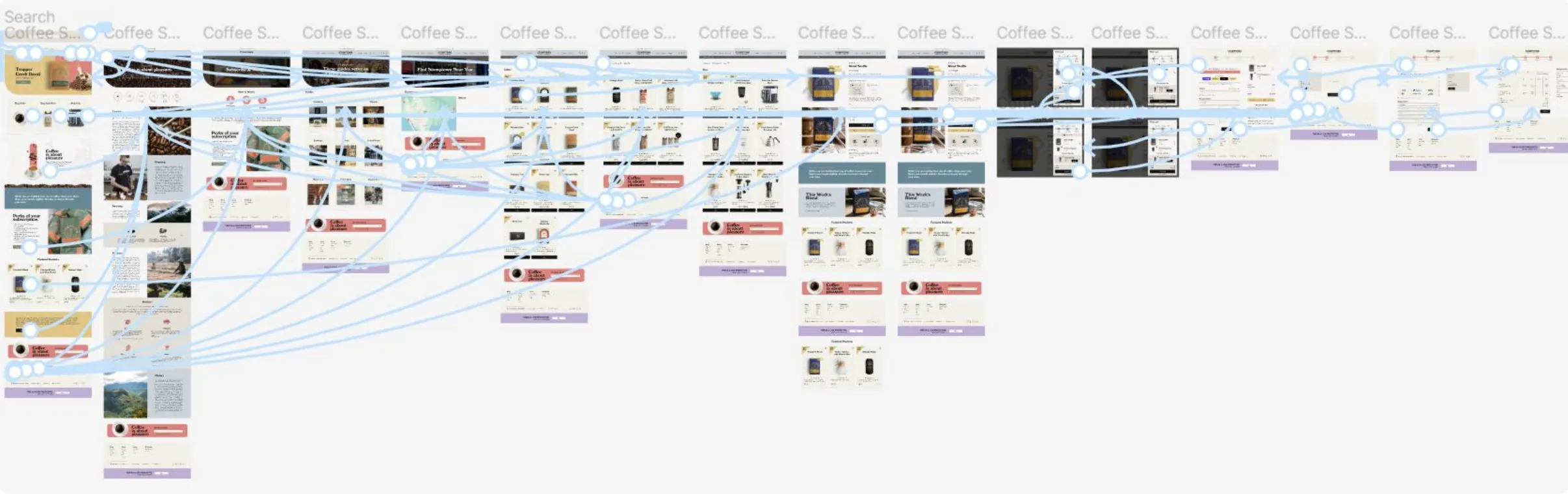
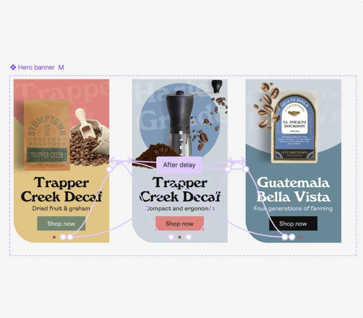
Screen recording of the Stumptown designs in Figma: desktop prototype with home page, brew guides, store locator, product page with subscription option and cart, then the mobile prototype and the design file with pages, layers and styles.
Key design decisions
Clarity, designed into every layer.
-
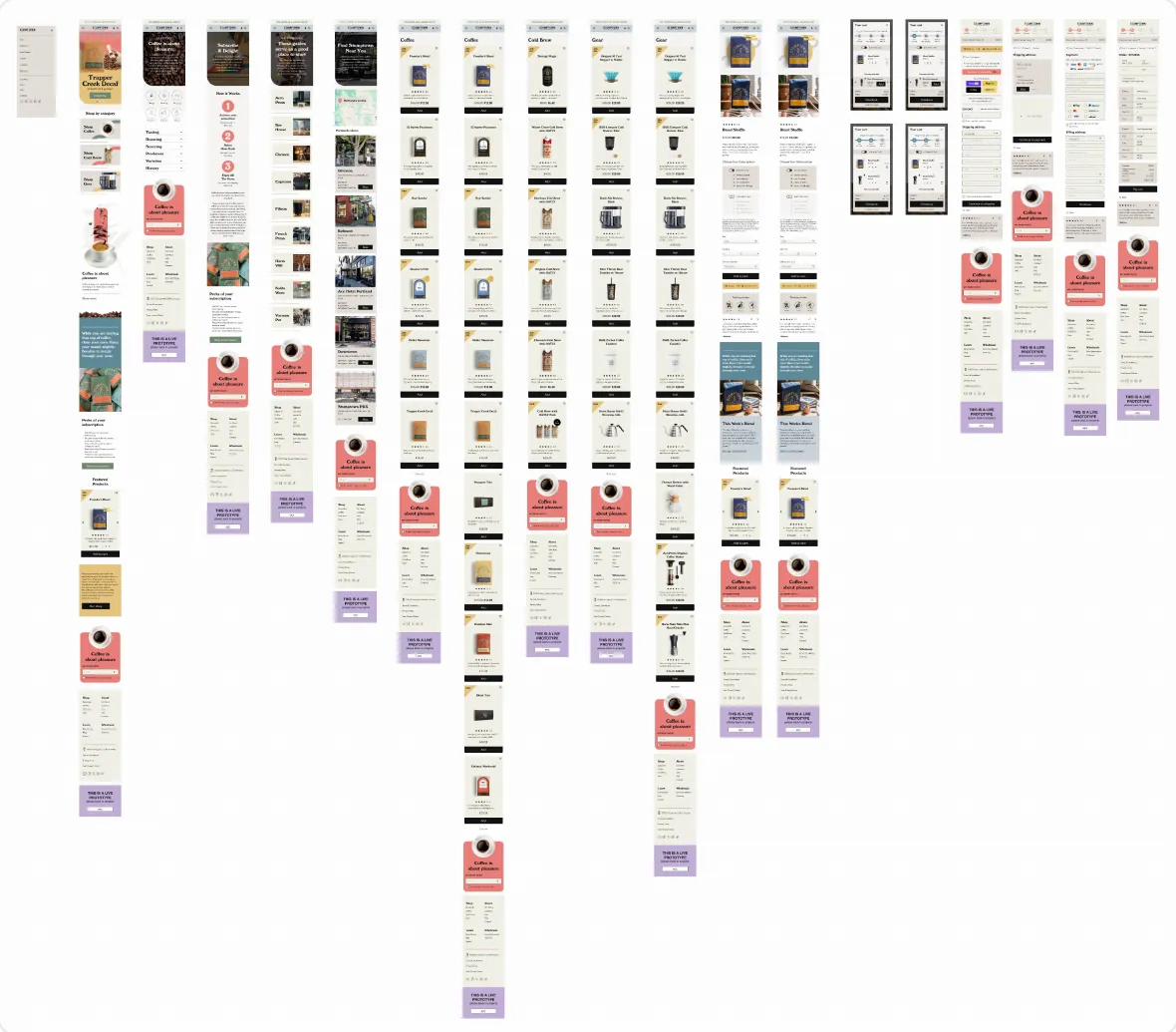
Lo-Fi Wireframes
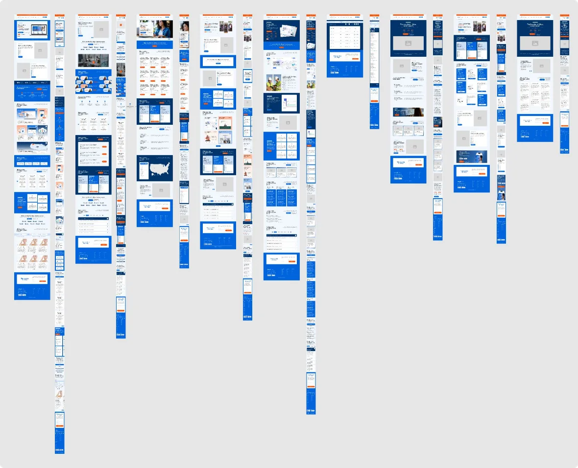
Low-fidelity wireframes simplify the shopping journey, creating a clear path from product discovery to checkout.
-
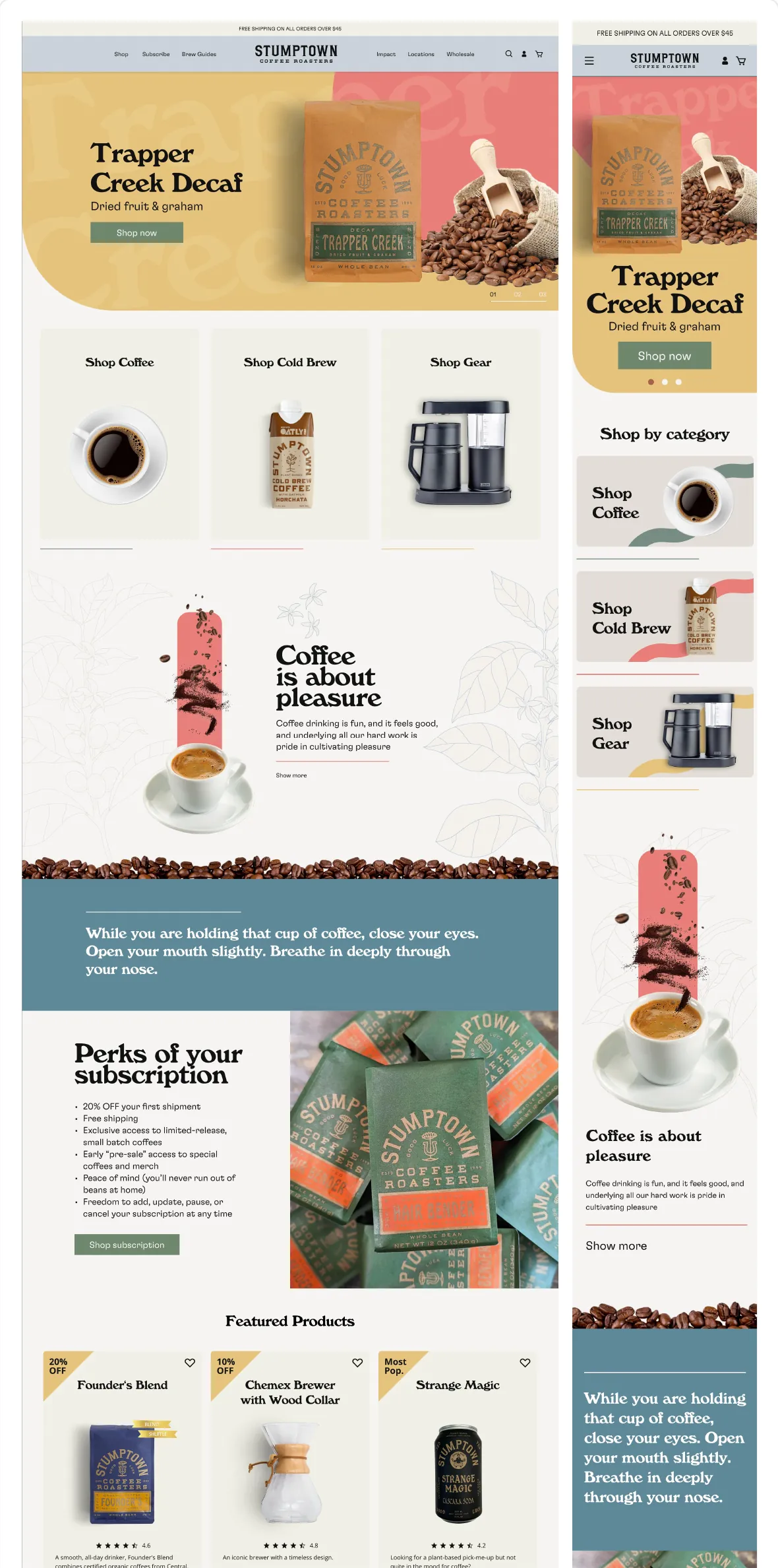
Final design
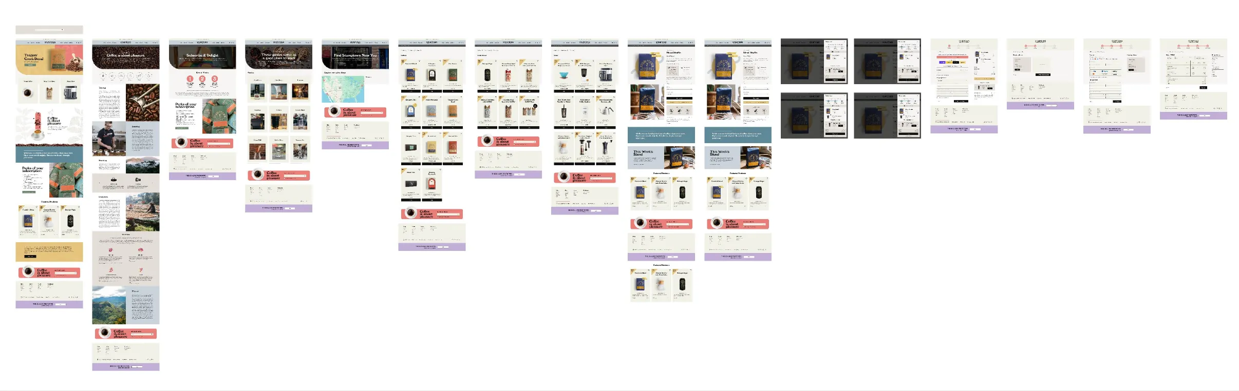
A clear hierarchy and focused product details simplify shopping and support confident purchase decisions on desktop and mobile.
-
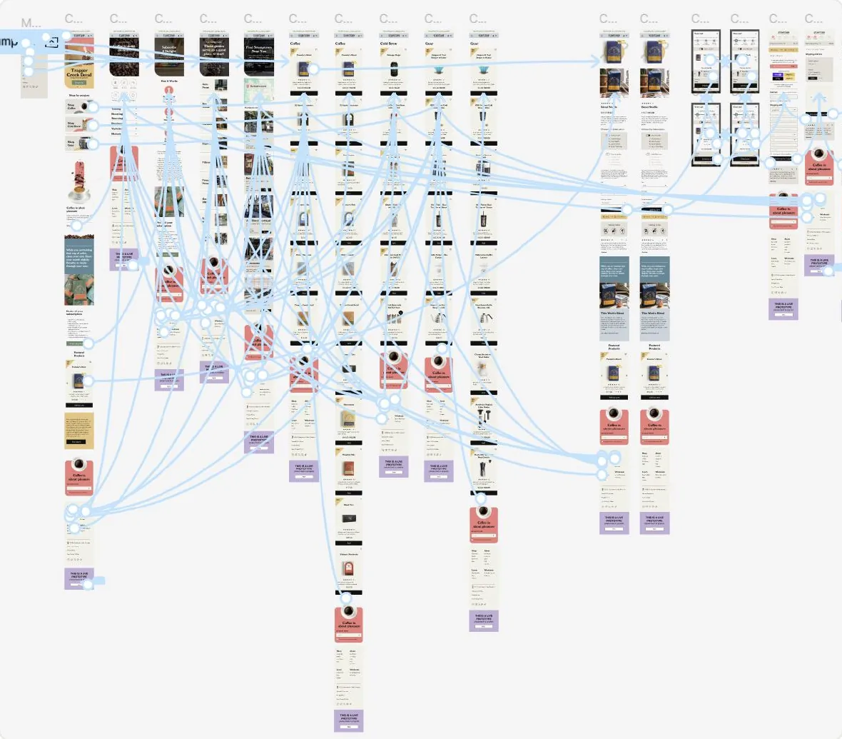
Prototyping
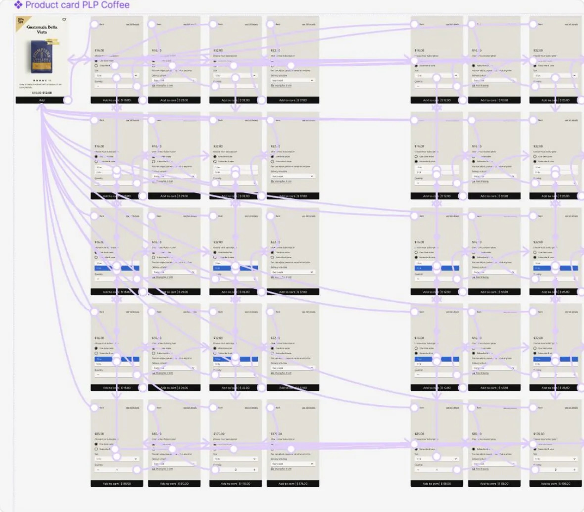
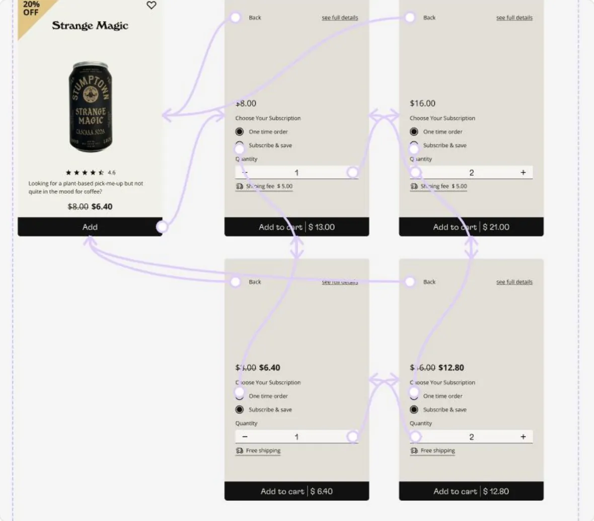
Desktop and mobile prototypes refine the shopping journey, making product selection and checkout clear and intuitive.
Approach & process
Evidence first. Expression second.
I explored how people shop at Stumptown and focused the redesign on three opportunity areas: orientation, product confidence, and checkout momentum. Each one shaped the wireframes, the final design, the design system, and the interactive prototypes for desktop and mobile.
Design system
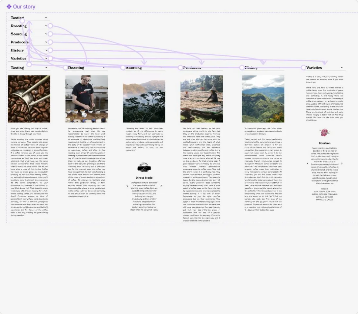
Consistency across the brand
Live website
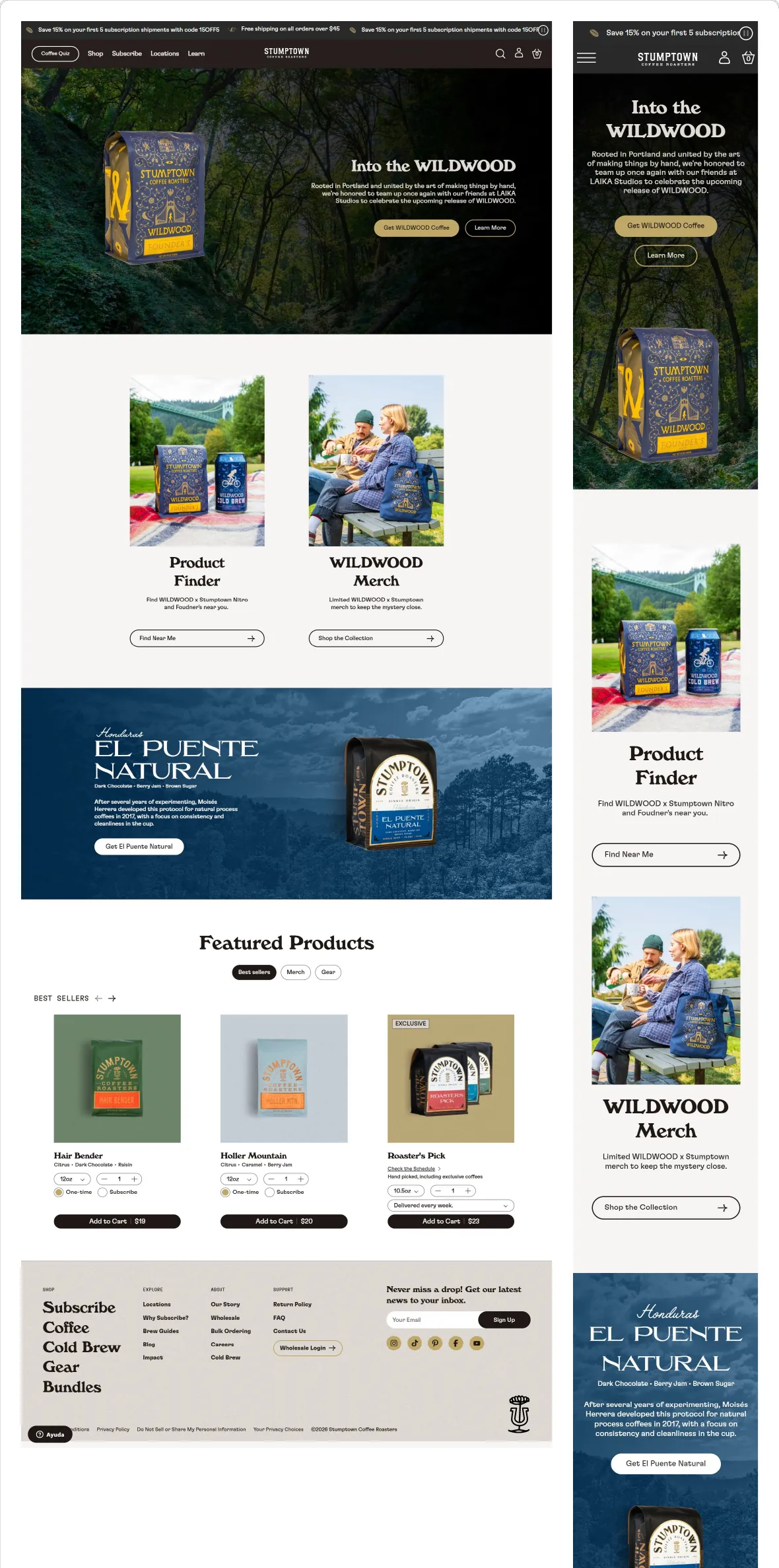
Figma design
Other projects
-
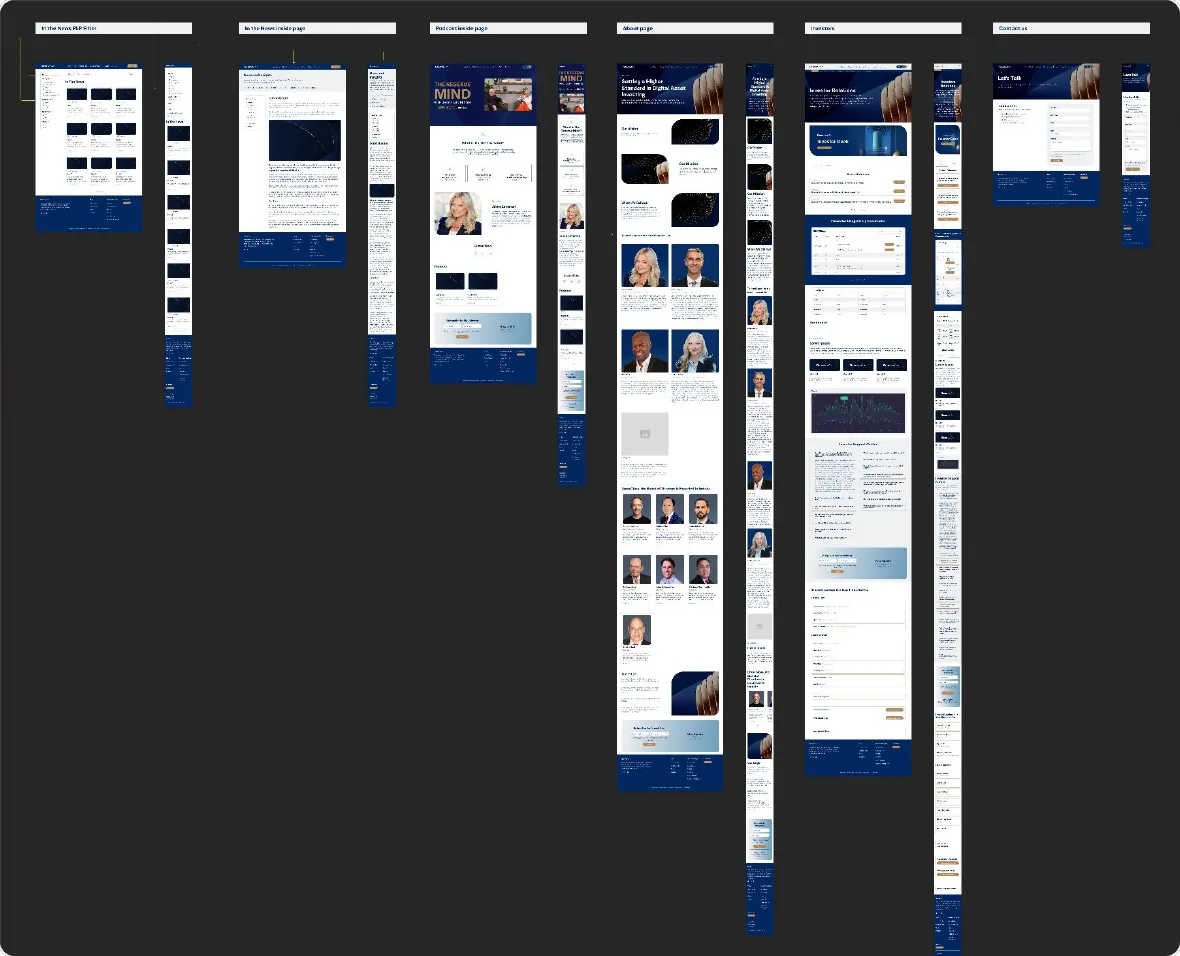
Website Rebuild on Framer — ReserveOne
ReserveOne
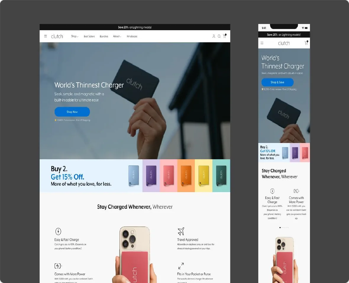
CRO for Website & Campaigns — Clutch Charger
Clutch Charger
Let’s build something remarkable.
Open to remote Senior UI/UX Designer and Design Lead positions.
- Email: andres.rendon.design@gmail.com
- WhatsApp: +57 301 792 4781
- LinkedIn: linkedin.com/in/andresrendonc
- Location: Medellín, Colombia · Remote
GET IN TOUCH
Fields marked with an asterisk are required.