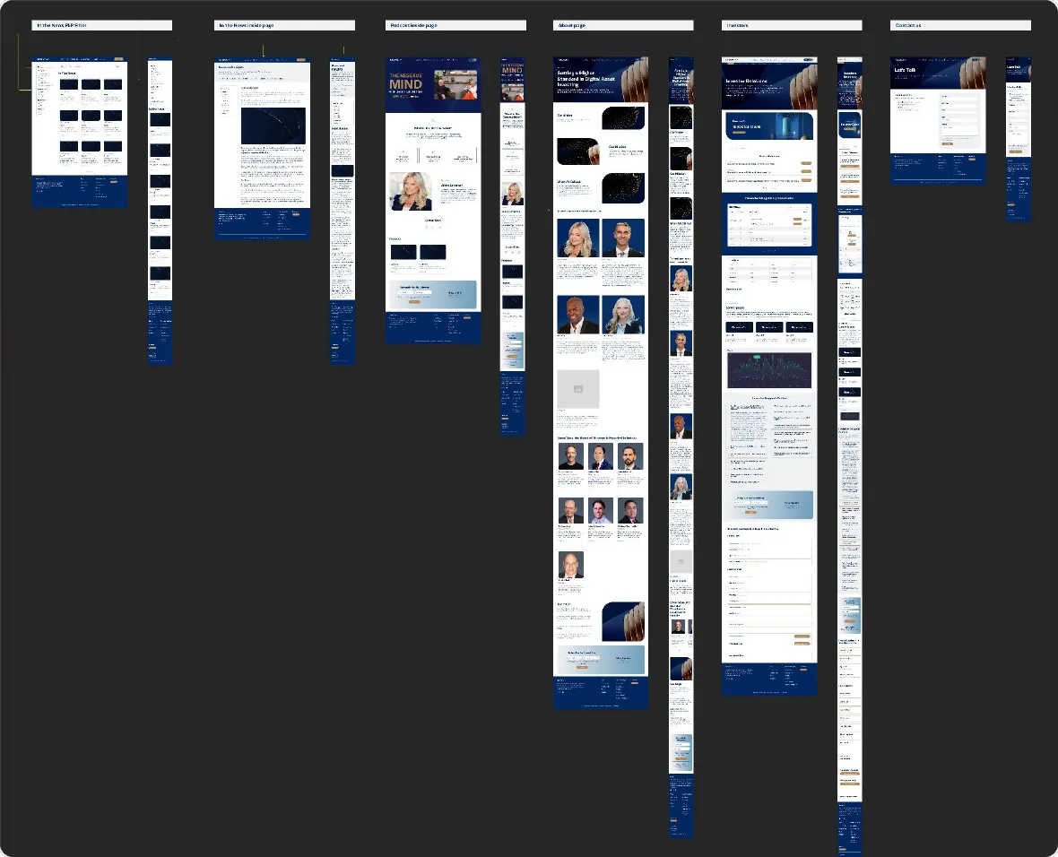
Website Rebuild on Framer — ReserveOne
ReserveOne
UI/UX Designer – Design Systems & CROMedellín, Colombia | Remote
This design was created for Power Digital Marketing. All rights reserved.
A scalable design system and responsive web experiences create consistency, improve usability, and support conversion rate optimization (CRO).
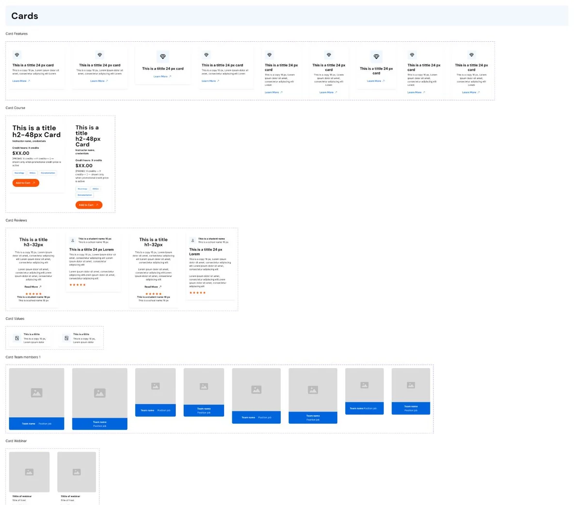
View website (opens in a new tab)Screen recording of the Edcetera design system in Figma: pages, atoms, molecules, components, text and color styles.
Key design decisions
Short sprints help clarify stakeholder needs, prioritize project goals, and align the team around a shared vision.
A simplified visual hierarchy makes course selection and checkout feel intuitive and sequential.
A multi-theme design system simplifies course discovery and purchasing, delivering a consistent experience across multiple brands.
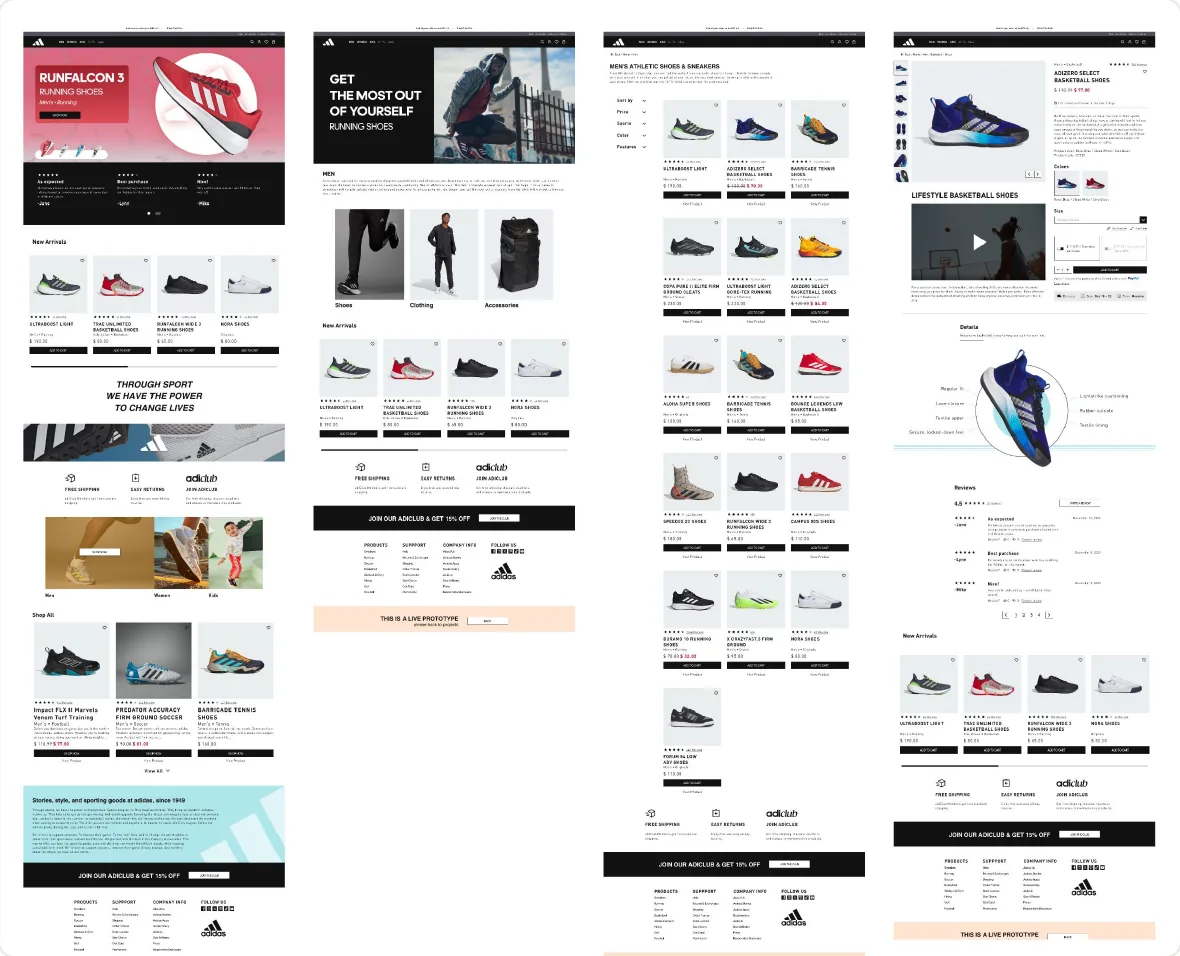
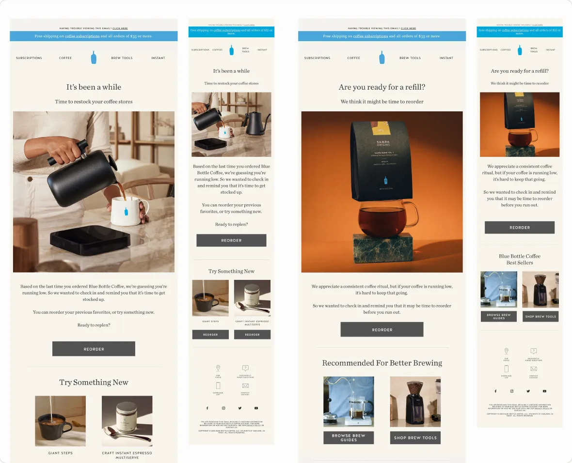
Reusable commerce patterns create a consistent experience across desktop and mobile while allowing flexibility for campaign-specific content.
Approach & process
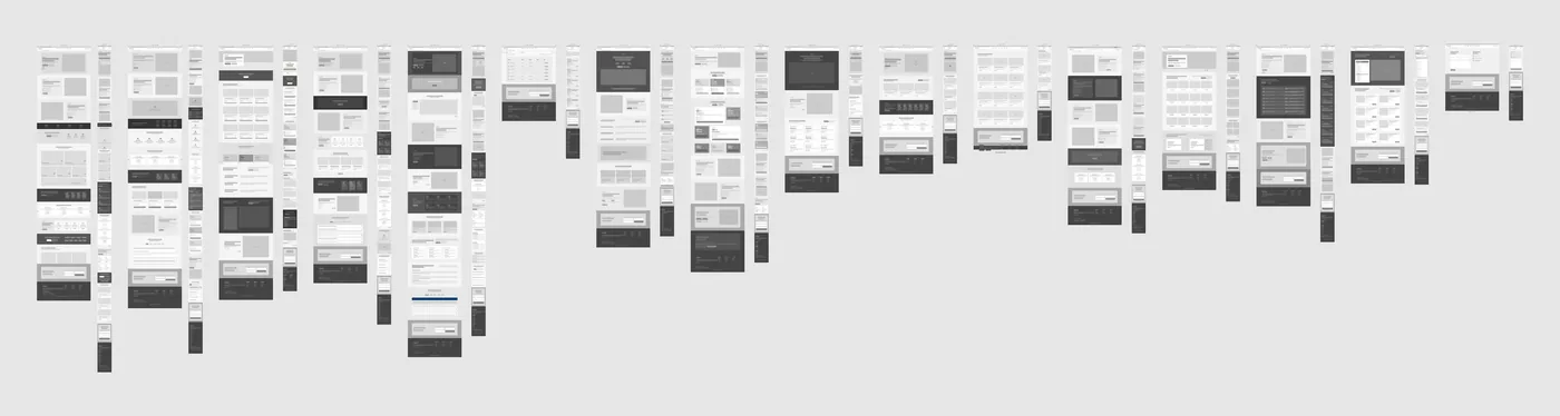
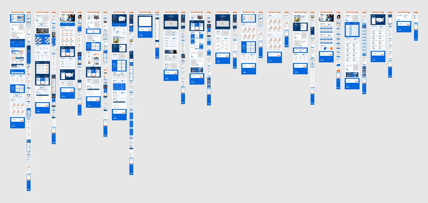
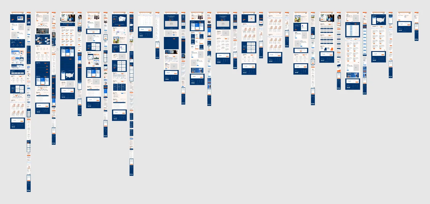
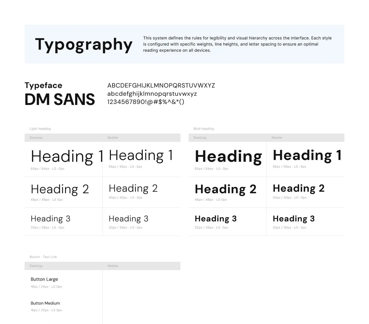
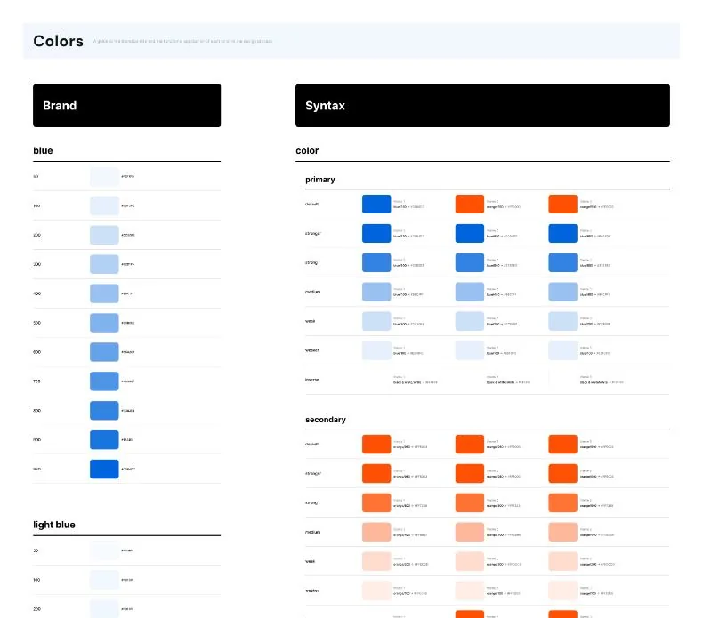
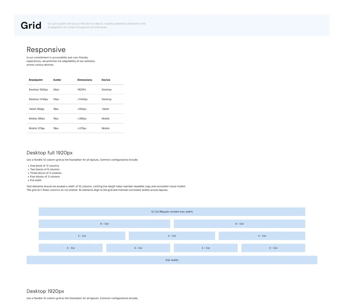
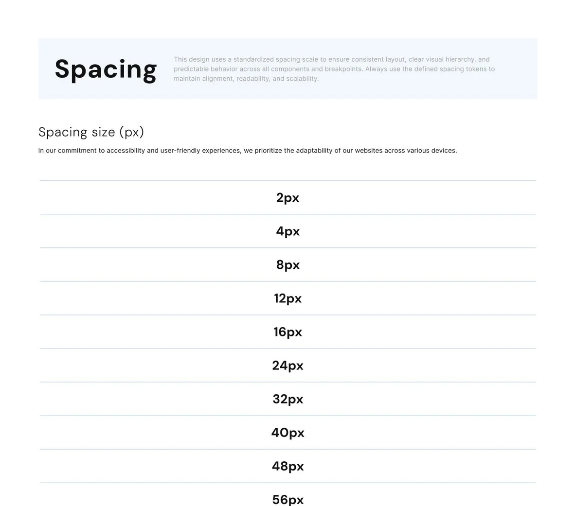
We built a scalable, multi-theme design system with more than 200 reusable components, organized using atomic design principles. This foundation promotes consistency, streamlines design workflows, and supports growth across products and brands.
Design system
The solution
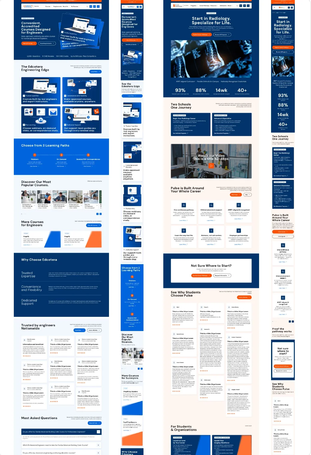
The responsive design system extends the experience across mobile and desktop, maintaining visual consistency and usability across multiple brands. Reusable components and adaptable layouts ensure a cohesive experience throughout course discovery and the learning journey.
ReserveOne
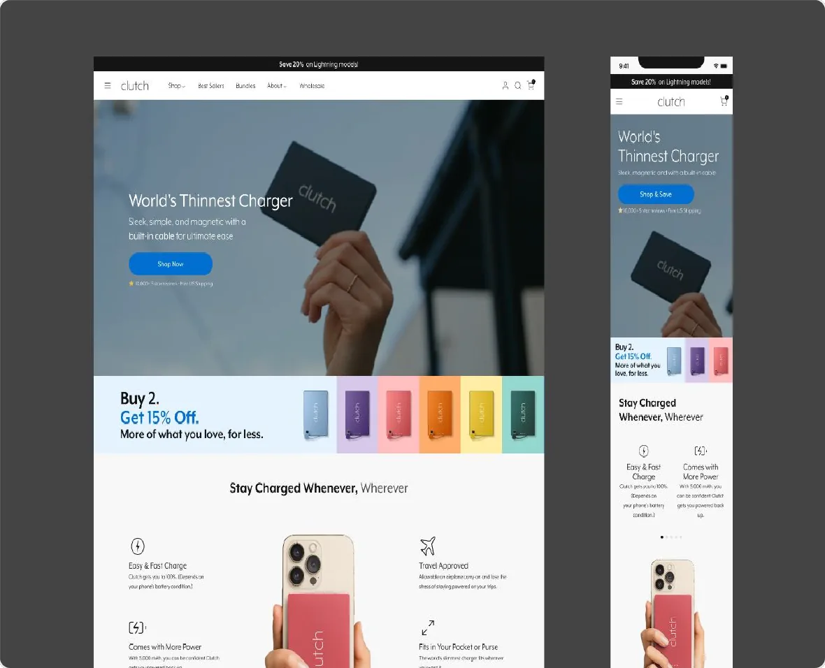
Clutch Charger
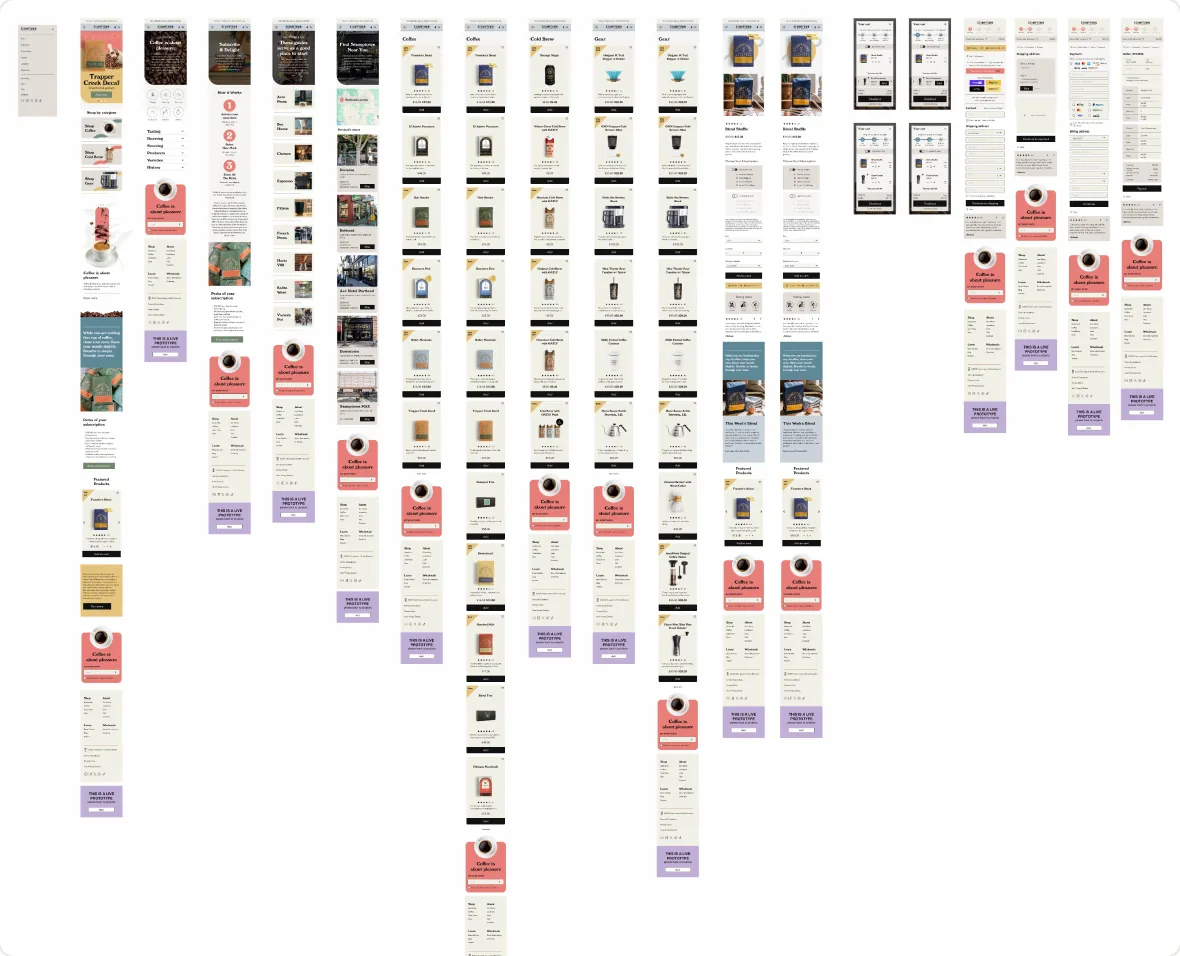
Stumptown
Open to remote Senior UI/UX Designer and Design Lead positions.
Fields marked with an asterisk are required.